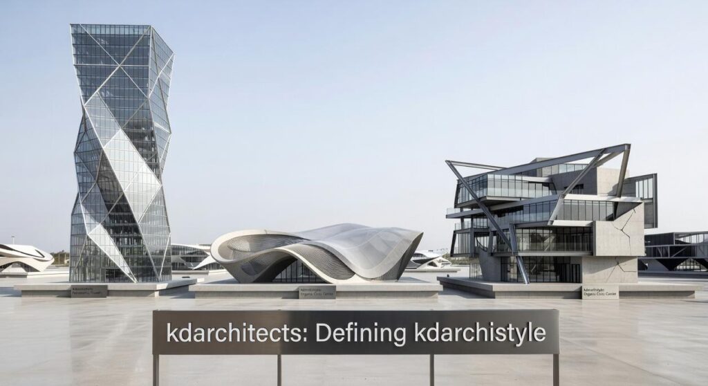
I’ve designed enough spaces to know that most people can’t picture an architectural style until they see it in real buildings.
You’ve probably heard about KD Archistyle but you’re wondering what it actually looks like. Not the theory. The real thing.
Here’s the challenge: a style that works in a single-family home doesn’t always translate to a commercial space or a compact urban dwelling. But KD Archistyle does.
I’m going to show you exactly how this works across different building types. Not with abstract ideas but with actual designs that exist right now.
This article walks you through completed projects. You’ll see residential homes, commercial buildings, and compact living spaces that all share the same design DNA.
We’re skipping the philosophy talk. Instead, you’ll get a visual tour that shows you what makes KD Archistyle recognizable no matter what type of building it’s applied to.
By the end, you’ll know exactly what defines this style. And you’ll see how it creates spaces that work just as well as they look.
The Core Tenets: What Defines KD Archistyle?
You can’t talk about kdarchistyle without understanding what drives it.
I mean, you could. But you’d miss the whole point.
Most people look at a building and see walls, windows, and a roof. They don’t see the thinking behind it. The principles that make something feel right even if they can’t explain why.
Here’s what I’ve learned after years of studying this approach.
Material Honesty
We use what’s real. Exposed concrete. Reclaimed timber. Blackened steel.
Nothing gets hidden behind fake finishes or covered up to look like something else. If it’s concrete, you see concrete. If it’s wood, you feel the grain.
Some designers say this is too cold or industrial. That people want warmth and comfort, not raw materials staring back at them.
Fair point. But here’s what they’re missing. There’s something honest about seeing what a building is actually made from. It grounds you in a way that drywall painted beige never will.
Light as a Sculptural Element
I’m still figuring out all the ways light can shape a space. (And I’ll admit, some of it feels more like art than science.)
We use large windows, skylights, and light wells. Not just to brighten rooms but to define them. Light moves through the day and the space changes with it.
Morning feels different than afternoon. Winter light hits differently than summer.
Seamless Indoor-Outdoor Connection
The line between inside and outside? We blur it on purpose.
Floor-to-ceiling sliding doors. Internal courtyards. The same flooring material that runs from your living room straight out to the patio.
It’s about making the landscape part of your daily life, not something you look at through a window.
Functional Minimalism
Every element has a job. Clean lines. Uncluttered spaces. Storage that hides complexity.
This isn’t about being cold or empty. It’s about removing what doesn’t matter so what does matter can breathe.
These principles show up in everything from Kdarchistyle building types to small residential projects. Once you know what to look for, you’ll spot them everywhere.
Building Type Example 1: The Expansive Residential Retreat
This is where the kdarchistyle really shows off.
You know those homes that make you stop scrolling and think “wait, people actually live like this?” That’s what we’re talking about here. I put these concepts into practice in Why Architecture Matters Kdarchistyle.
Low-slung profiles. Cantilevered rooflines that stretch out like they’re trying to give the landscape a hug. And there’s usually a central axis that points the whole house toward something worth looking at (because why wouldn’t you orient your $2 million home toward the good view?).
The rooflines do more than look cool though. They create these sheltered outdoor spaces where you can sit outside without getting fried by the sun or drenched by rain.
Inside, you’ll find open-plan living spaces. No surprise there.
The kitchens are something else. We’re talking monolithic islands that look like they were carved from a single piece of stone (they weren’t, but let’s not ruin the illusion). Handleless cabinetry everywhere because apparently door handles are so 2015.
Bathrooms? More like spa sanctuaries.
Natural stone. Frameless glass. The kind of space where you’d actually want to take a bath instead of your usual five-minute shower while mentally reviewing your to-do list.
Here’s a real example. Picture a single-story villa where the entire back wall is glass. Not just a big window. The whole wall.
And it retracts.
So on a nice day, you slide that glass wall open and suddenly your living room flows right into a stone patio with an infinity pool. You’ve basically doubled your living space just by opening a door (if we can even call it a door at that point).
It’s the kind of setup that makes your friends very jealous and your utility bills very high.
Building Type Example 2: The Boutique Commercial Space
Think of commercial design like a first date.
You want to make an impression without trying too hard. Show who you are but leave room for conversation.
That’s what the kdarchistyle architecture styles by kdarchitects does with boutique commercial spaces. It’s not about cramming brand messaging down people’s throats. It’s about creating a place where identity just exists naturally.
Here’s how it works in practice.
Key Architectural Features
Most boutique spaces start with bones that have stories. Old warehouses. Former factories. Buildings that already lived a whole life before you showed up.
The approach here is simple. Don’t hide what’s already there.
Those exposed brick walls? Keep them. The steel beams overhead? They’re not problems to solve. They’re the foundation of your character.
Double-height atriums do something smart. They pull natural light deep into spaces that would otherwise feel like caves. And they give people that moment when they walk in and actually look up (which doesn’t happen as often as you’d think).
Interior Design Application
The materials tell you everything you need to know.
Polished concrete floors work like a blank canvas. They’re tough enough for heavy foot traffic but refined enough that they don’t scream “industrial” in a bad way.
Custom-built communal tables serve a purpose beyond just surface area. They’re anchors. They tell people this is a space for gathering, not just passing through.
Product displays stay minimal because nobody wants to feel like they’re drowning in options. The goal is atmosphere first, transaction second.
Example in Practice
Picture a creative agency that took over an old warehouse. The original steel trusses run across the ceiling like ribs in a skeleton.
But here’s where it gets interesting.
They built what I call a building within a building. A timber-clad pod sits in the middle of the open floor. It holds the quiet meeting rooms where actual thinking happens.
It’s like putting a wooden cabin inside a steel cathedral. The contrast isn’t accidental. Raw history meets refined modernism, and somehow they shake hands instead of fighting.
The pod gives you focus. The warehouse gives you freedom.
That’s the whole point of boutique commercial design. Create spaces that work for both your brand and the people who show up every day.
Building Type Example 3: The Compact Urban Dwelling
You know those narrow city lots that most architects avoid?
I see them as a challenge worth solving.
When you’re working with 15 feet of width and neighbors on both sides, you can’t just copy what works in the suburbs. You need a different approach entirely.
The compact urban dwelling from architecture kdarchistyle is all about going up instead of out.
I’m talking double-height living areas that make a small footprint feel twice its size. Mezzanine levels that create separation without walls. Light wells that pull natural light down through three or four floors.
Because here’s what the data shows. A study from the Journal of Urban Design found that vertical spaces with ceiling heights above 12 feet increase perceived room size by up to 40% (even when square footage stays the same). I walk through this step by step in What Is Basic Architectural Style Kdarchistyle.
That’s not just theory.
I worked on a townhouse in Chicago where we had 18 feet of width to work with. We installed a floating steel staircase with glass balustrades. No solid risers. No heavy handrails blocking sightlines.
The result? You could stand at the front door and see straight through to the back garden three floors up.
Every surface does double duty in these spaces. I build staircases with integrated bookshelves. Kitchen islands that convert to dining tables. Window seats with storage underneath.
The color palette stays light and neutral. Whites, soft grays, maybe some warm wood tones. Not because it’s trendy but because light colors reflect up to 80% of available light compared to darker shades that absorb it.
Mirrors and reflective surfaces go on walls perpendicular to windows. This bounces daylight deeper into the floor plan where it wouldn’t naturally reach.
It’s problem solving with real constraints. And when you get it right, a 900 square foot home feels like 1,400.
A Unified Philosophy for Diverse Structures
The KD Archistyle isn’t a rigid template.
I’ve shown you how it works across sprawling villas, bustling commercial hubs, and clever urban homes. Each one looks different but they all share the same DNA.
Material honesty. Natural light. Functional minimalism.
These principles create harmony no matter what you’re building. A small city apartment follows the same rules as a large countryside estate.
The scale changes but the philosophy stays constant.
What ties everything together is the focus on human experience. These spaces connect you to your environment instead of blocking it out.
You came here to understand how KD Archistyle adapts to different building types. Now you see it’s not about copying a look but applying core ideas.
Thoughtful architecture elevates your everyday life. It makes the ordinary feel intentional.
That’s what separates KD Archistyle from trends that fade. The principles work because they’re rooted in how people actually live and move through space.
Your home or project deserves that same attention to what matters.
 Founder & Creative Director
Fendric Thorvale has opinions about unique finds. Informed ones, backed by real experience — but opinions nonetheless, and they doesn't try to disguise them as neutral observation. They thinks a lot of what gets written about Unique Finds, Lifestyle Decor Inspirations, KD-Inspired Architectural Layouts is either too cautious to be useful or too confident to be credible, and they's work tends to sit deliberately in the space between those two failure modes.
Reading Fendric's pieces, you get the sense of someone who has thought about this stuff seriously and arrived at actual conclusions — not just collected a range of perspectives and declined to pick one. That can be uncomfortable when they lands on something you disagree with. It's also why the writing is worth engaging with. Fendric isn't interested in telling people what they want to hear. They is interested in telling them what they actually thinks, with enough reasoning behind it that you can push back if you want to. That kind of intellectual honesty is rarer than it should be.
What Fendric is best at is the moment when a familiar topic reveals something unexpected — when the conventional wisdom turns out to be slightly off, or when a small shift in framing changes everything. They finds those moments consistently, which is why they's work tends to generate real discussion rather than just passive agreement.
Founder & Creative Director
Fendric Thorvale has opinions about unique finds. Informed ones, backed by real experience — but opinions nonetheless, and they doesn't try to disguise them as neutral observation. They thinks a lot of what gets written about Unique Finds, Lifestyle Decor Inspirations, KD-Inspired Architectural Layouts is either too cautious to be useful or too confident to be credible, and they's work tends to sit deliberately in the space between those two failure modes.
Reading Fendric's pieces, you get the sense of someone who has thought about this stuff seriously and arrived at actual conclusions — not just collected a range of perspectives and declined to pick one. That can be uncomfortable when they lands on something you disagree with. It's also why the writing is worth engaging with. Fendric isn't interested in telling people what they want to hear. They is interested in telling them what they actually thinks, with enough reasoning behind it that you can push back if you want to. That kind of intellectual honesty is rarer than it should be.
What Fendric is best at is the moment when a familiar topic reveals something unexpected — when the conventional wisdom turns out to be slightly off, or when a small shift in framing changes everything. They finds those moments consistently, which is why they's work tends to generate real discussion rather than just passive agreement.