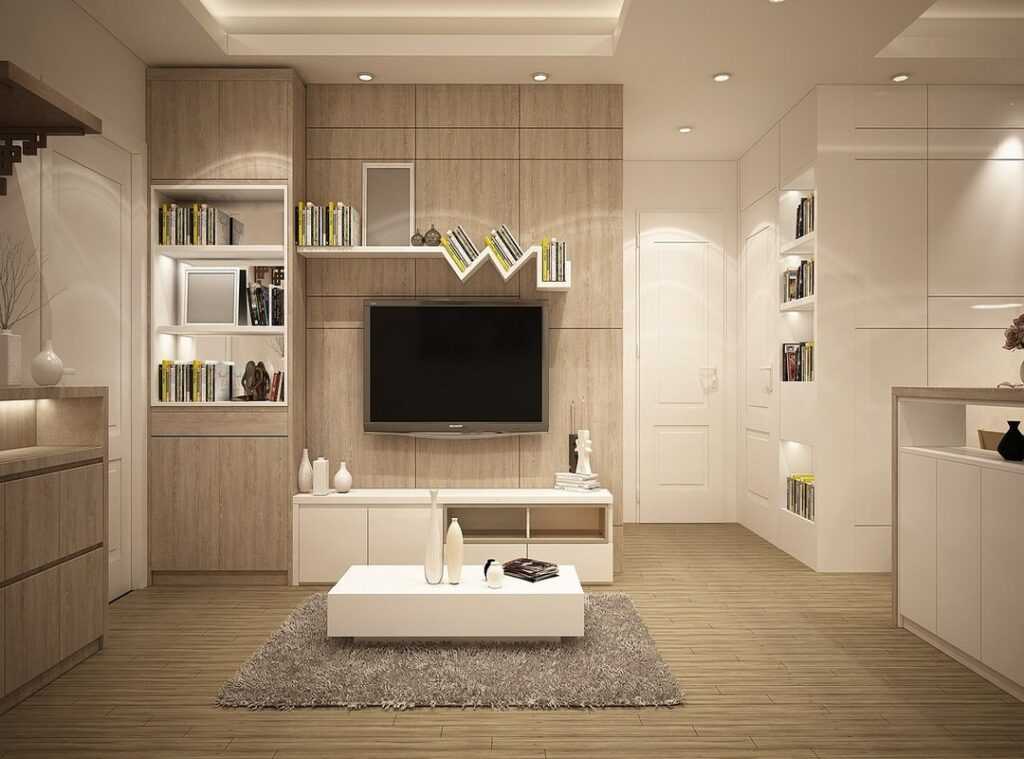
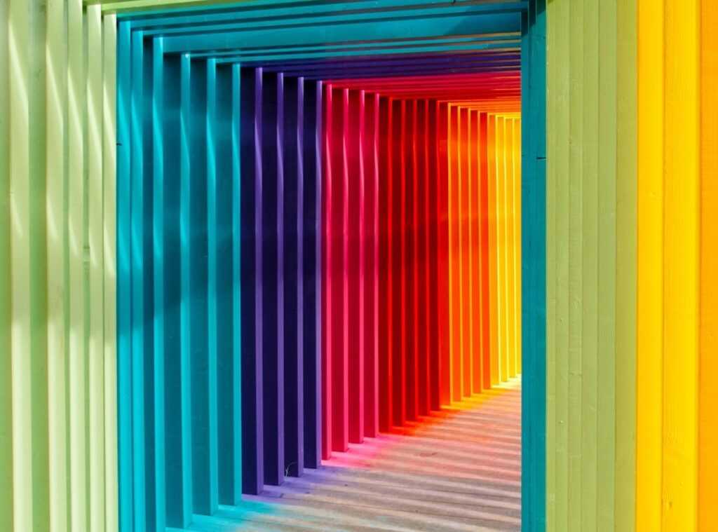
Choosing paint colors is a daunting task, isn’t it? We’ve all stood in the paint aisle, staring at endless swatches, feeling overwhelmed. But here’s the secret: color isn’t just decoration.
It’s solid. It transforms spaces, influences mood, and even alters perceptions. Ever walked into a room and felt instantly calm or energized?
That’s color psychology interiors at work.
You’re not alone in this. Experts agree that choosing the right colors can dramatically change your living spaces. I’ve spent years following interior design trends and research, and I’m here to share what I’ve learned.
This isn’t just a guessing game. It’s a science.
You’ll get practical advice grounded in real takeaways (no fluff). Let’s cut through the noise and make your home feel as good as it looks. You deserve a space that works for you.
Trust this guide to help you use the power of color. Ready to transform your home?
Color Psychology: Interiors That Speak
Ever walked into a room and felt instantly calm or energized? That’s color psychology interiors at work. Colors aren’t just decorative; they’re emotional triggers.
Blue rooms often feel serene. Why? Because blue mimics the sky, conjuring peace.
Red, on the other hand, can make a room feel alive, buzzing with energy (like) a beating heart.
Each color tells its own story. Take green, for instance. It’s nature’s favorite, grounding us in lush tranquility.
Imagine a living room bathed in green. Feels restorative, right? Yellow, though, screams happiness and optimism.
Perfect for a kitchen where you need a morning boost.
Not convinced yet? Science backs this up. Studies show colors can impact mood and even behavior.
According to recent research, warm colors can stimulate conversation and appetite (handy for dining rooms), while cool hues promote focus and calm. Have you noticed how gyms use red or orange? They know it pumps up the adrenaline.
But it’s not just about slapping on paint. The texture and lighting alter perception too. A matte blue wall feels different from a glossy one.
Lighting changes everything. A dim red room might feel cozy or claustrophobic, depending on your mindset.
Want to dive deeper into the world of color and design? Check out exploring minimalist interior design trends for more takeaways. Pro tip: Experiment with color swatches at home before committing.
Your walls are canvases, after all. Make them speak your style, your mood, your story.
Color Choices: Rooms with Purpose
Choosing colors for different rooms isn’t just about what looks good. It’s about how a space feels when you walk into it. Color psychology interiors matter.
For bedrooms, calm is key. You want colors that whisper “relax” after a long day. Think soft blues and greens.
They’re not just pretty; they help you sleep better (science backs this up).
On the flip side, home offices need energy. You’re gonna want a splash of something bold. Reds and yellows are your friends here.
They’re known to boost productivity and creativity. Don’t just paint and hope for the best. Test!
A quick sample on the wall can save you from a disaster later.
Natural light changes everything. A color that looks one way in the morning can turn entirely different by afternoon. Ever notice how a room seems to shift with the sun?
That’s why lighting is a big player in your color choice.
Not sure what works? Try this: paint a piece of poster board and move it around the room. This trick shows how a color morphs in different spots.
Trust me, it’s better than regretting that bright red living room because you didn’t test first.
Pro tip: If a room gets lots of natural light, cooler tones work well. But if it’s dark and cozy, warm tones (like terracotta) can add comfort.
Bottom line, know your room and its purpose. It saves time, money, and headaches. And remember, it’s your space.
Make it work for you.
Color Vibes: What’s In for Modern Interiors
Color trends in interiors are shifting faster than you can say “millennial pink.” These days, it’s all about bold greens and warm terracottas. Why? Because they feel natural and grounded. Color psychology interiors is the real deal here.
Colors aren’t just for show; they evoke emotions and set moods. Ever felt energized by a bright yellow room or soothed by a soft blue one? That’s no accident.
Global trends play a big role too. Think about how the “Rise Of Biophilic Design In Interiors” has pushed earthy tones and natural textures to the forefront. It’s more than a trend; it’s about bringing the outside in. (Mother Nature knows best.)
But what if you’re not ready for a full overhaul? Small changes can make a big impact. Paint an accent wall or add colorful throw pillows.
Even swapping out a rug can breathe new life into a space. Pro tip: Use paint samples on walls first. It saves you from color regret.
Want to know if your home is on trend? Just ask yourself: Does it feel like a cozy retreat? If yes, you’re nailing it.
If not, maybe it’s time for a little color refresh.
Color and Architecture: A Bold Blend
Using color to spotlight architectural features isn’t just smart. It’s important. Why?
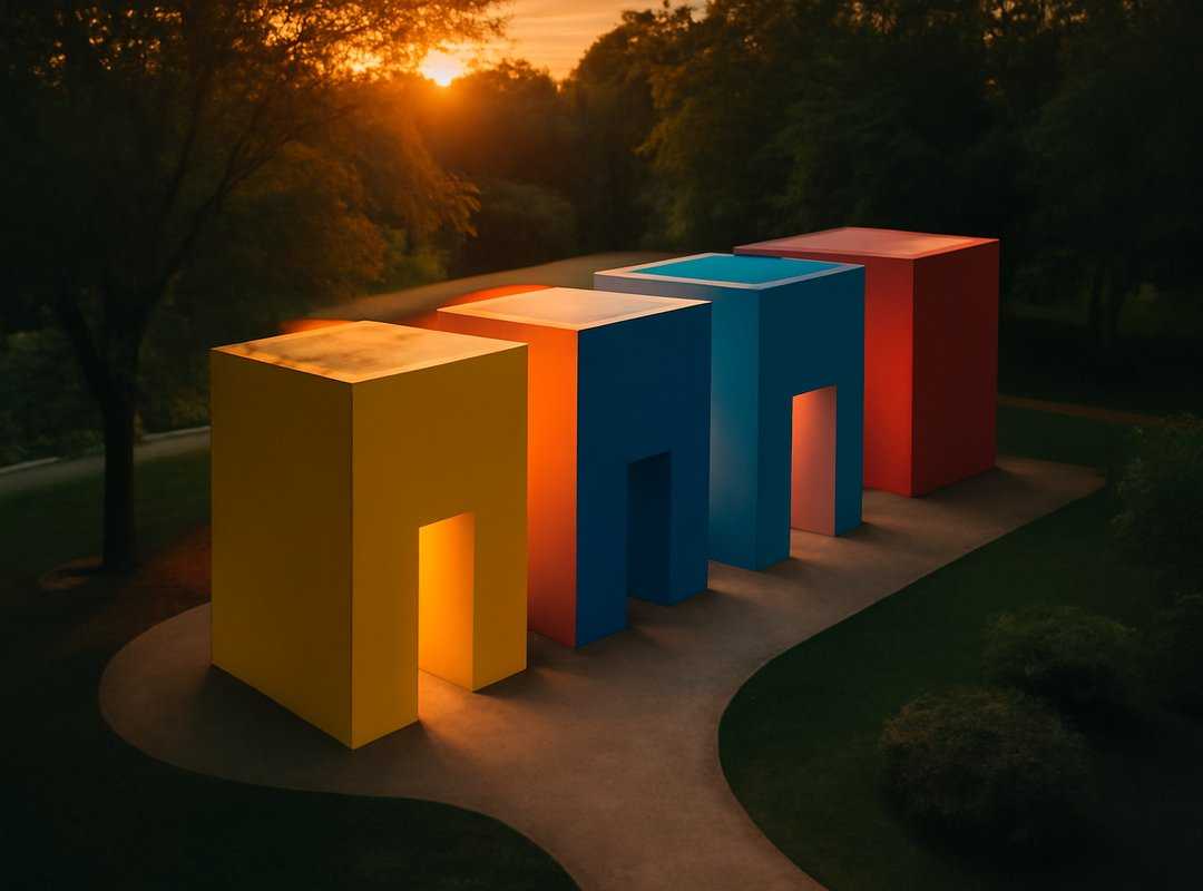
Because color has the power to transform a space from bland to striking. Take accent walls, for example. They can make a room pop without screaming for attention.
You’ve seen it. A dull room suddenly becomes a designer’s dream with a splash of paint. It’s magic, really.
But let’s not stop there. Painted trim can boost lines and shapes, giving rooms a sophisticated edge. The key is balance.
Too much bold color can overwhelm, while neutral tones might fade into the background. It’s a dance of contrasts, really. You want colors that complement each other, not compete.
Pro tip: Use contrasting colors to highlight specific areas. A deep blue can make white crown molding pop. It’s all about creating visual interest.
Think of it as storytelling with color. And don’t just take my word for it. Dive into color psychology interiors to see how different shades affect mood and perception.
In the end, it’s about expressing personality through the space. Have fun with it. Be daring.
After all, architecture is art, and your home is your canvas.
Color Choices: Avoiding Common Mistakes
Picking colors for your home isn’t just about what looks good. It’s about how it feels. Ever walked into a room and felt uneasy?
That’s color psychology interiors at work. One mistake I see all the time is ignoring the light in a room. A color that looks amazing in a bright showroom can feel like a dungeon in your dim living room.
Here’s a tip: test paint samples at different times of day. Another blunder is choosing too many bold colors. It can make a space feel chaotic.
You know that feeling when every wall is screaming for attention? Not relaxing.
And don’t even get me started on trends. Just because it’s hot on Instagram doesn’t mean it works in your space. Plan your color scheme thoughtfully.
Consider the mood you want. Your home’s vibe hinges on it. Get it wrong, and you might feel off every time you walk through the door.
Raise Your Home’s Charm
Color’s power isn’t just in your head. Understanding color psychology interiors can transform your space. Dive into the tips here.
Explore, test, and see. Want more? Check resources or consult pros.
Your home deserves it. Ready to make a change? Visit kdarchistyle.net and start today.
 Senior Interior Design Specialist
Ronald Sheppardivers has opinions about interior design concepts and trends. Informed ones, backed by real experience — but opinions nonetheless, and they doesn't try to disguise them as neutral observation. They thinks a lot of what gets written about Interior Design Concepts and Trends, Lifestyle Decor Inspirations, KD-Inspired Architectural Layouts is either too cautious to be useful or too confident to be credible, and they's work tends to sit deliberately in the space between those two failure modes.
Reading Ronald's pieces, you get the sense of someone who has thought about this stuff seriously and arrived at actual conclusions — not just collected a range of perspectives and declined to pick one. That can be uncomfortable when they lands on something you disagree with. It's also why the writing is worth engaging with. Ronald isn't interested in telling people what they want to hear. They is interested in telling them what they actually thinks, with enough reasoning behind it that you can push back if you want to. That kind of intellectual honesty is rarer than it should be.
What Ronald is best at is the moment when a familiar topic reveals something unexpected — when the conventional wisdom turns out to be slightly off, or when a small shift in framing changes everything. They finds those moments consistently, which is why they's work tends to generate real discussion rather than just passive agreement.
Senior Interior Design Specialist
Ronald Sheppardivers has opinions about interior design concepts and trends. Informed ones, backed by real experience — but opinions nonetheless, and they doesn't try to disguise them as neutral observation. They thinks a lot of what gets written about Interior Design Concepts and Trends, Lifestyle Decor Inspirations, KD-Inspired Architectural Layouts is either too cautious to be useful or too confident to be credible, and they's work tends to sit deliberately in the space between those two failure modes.
Reading Ronald's pieces, you get the sense of someone who has thought about this stuff seriously and arrived at actual conclusions — not just collected a range of perspectives and declined to pick one. That can be uncomfortable when they lands on something you disagree with. It's also why the writing is worth engaging with. Ronald isn't interested in telling people what they want to hear. They is interested in telling them what they actually thinks, with enough reasoning behind it that you can push back if you want to. That kind of intellectual honesty is rarer than it should be.
What Ronald is best at is the moment when a familiar topic reveals something unexpected — when the conventional wisdom turns out to be slightly off, or when a small shift in framing changes everything. They finds those moments consistently, which is why they's work tends to generate real discussion rather than just passive agreement.